About Our Branding
While our branding, like other organizations, is demonstrated through a specific color pallet, graphics, photography, videos, and logos—there’s a lot more to it than simple design. These things all work together to tell the world who we are and what we stand for—our past, our present and our future. They come together to tell a story.
The Red Cross
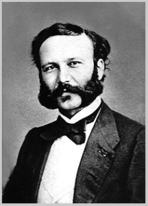 The idea of the Red Cross was born in 1859, when Henry Dunant, a young Swiss man of Christian faith, came upon the aftermath of a bloody battle between imperial Austria and the Franco-Sardinian alliance in Solferino, Italy. Over 40,000 men lay dead or dying on the battlefield, and the wounded were not given medical attention.
In an effort to save lives, Dunant organized locals to dress soldiers’ wounds, to feed them and provide water, and to comfort them in the midst of unimaginable horror. When he returned to Geneva, he tirelessly advocated for the creation of an organization that would assist the wounded in war.
During his efforts, Dunant asked as simple but profound question, “Would there not be some means, during a period of peace and calm, of forming relief societies whose object would be to have the wounded cared for in time of war by enthusiastic, devoted volunteers, fully qualified for the task?”
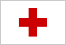 In 1863, the same year the American Civil War started, Dunant and four other men created the International Committee for Relief to the Wounded, which would later become the International Committee of the Red Cross. Its emblem of course, is a red cross on a white background, or the inverse of the Swiss flag. Within a year, 12 countries came together to adopt the first Geneva Convention; a milestone in human history to be sure, by defining medical services as being entirely “neutral” on the battlefield. More than a century later, the Red Cross is universally associated with medical care in the field throughout the world. While other symbology has been adopted such as the Red Crescent for predominantly Muslim nations, and Red Crystal (Diamond) in Israel—there is no question that the Red Cross is the dominant symbol around the world.
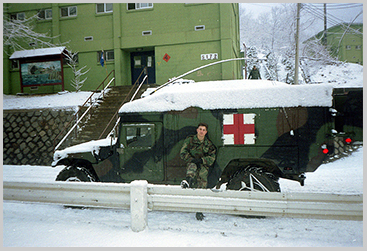 The founders of Boots on the Ground (BOTG) are former military medics, who’ve all worn the Red Cross brassard. They’ve all carried Geneva Conventions identification cards with the Red Cross emblazoned upon it. They’ve all driven (or flew in) military vehicles (Ambulances, Humvees, APCs, MRAPs, UH-1 Iroquois, Blackhawks, etc) with the Red Cross on the side. Ultimately, the Red Cross is a symbol we all know and have worked under, a symbol our brothers and sisters have died for. It’s not surprising then that the symbol carries with it significant meaning and weight to us, and why we’d want to show homage, respect, and reverence to it by incorporating it in some way, into our own identity. But there are use restrictions placed on it by law.
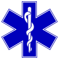
The Star of Life
 For decades civilian ambulances and medical personnel in the United States used a Red Cross or a safety orange cross on a square background of reflectorized white to identify themselves to the public. However, in 1973 that began to change when the Red Cross complained that the orange cross too closely resembled their logo, which as noted above, is restricted by the Geneva Conventions.
The Chief of the EMS Branch of the National Highway Traffic Safety Administration (NHTSA) at the time, Leo R. Schwartz, began developing a symbol that could be used universally to represent emergency medical services. He adapted aspects of the Medical Identification Symbol of the American Medical Association, and incorporated the Rod of Asclepius to create what is now known as the Star of Life. This new symbol is a blue, six-pointed star, outlined with a white border was trademarked on February 1, 1977 by the NHTSA. Twenty years later its use was gifted to the National Registry of Emergency Medical Technicians (NREMT) to represent Emergency Medical Technicians universally. Today, the Star of Life can be found in use all over the world—on emergency medical vehicles, on uniforms, on equipment, and all manner of merchandice marketed to the medic community.
Symbology
Like many logos, the history of the Star of Life also contains elements that have specific meaning. The six branches of the star represent the six main tasks executed by rescuers all through the emergency chain, namely:
Detection: The first rescuers on the scene observe, understand, identify dangers to themselves and the others, and take appropriate safety measures.
Reporting: The call for professional help is made and dispatch is connected with the victims, providing emergency medical dispatch.
Response: The first rescuers provide first aid and immediate care to the extent of their capabilities.
On scene care: The EMS personnel arrive and provide immediate care to the extent of their capabilities on-scene.
Care in transit: The EMS personnel proceed to transfer the patient to a hospital via an ambulance or helicopter for specialized care.
Transfer to definitive care: Appropriate specialized care is provided at the hospital.
The Cross-Star
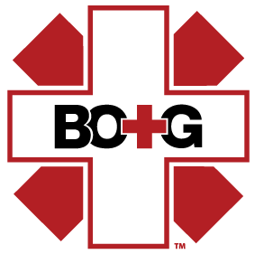 Like most organizations, we wanted to have something unique to represent us. Something distinctive, appropriate, practical, graphically simple in form, memorable, and that conveys meaning. That’s a tall task to be sure, but we are privileged to work with some incredibly talented creative artists and designers who were able to take our vision, ideas and ideals, concepts, dreams, hopes, desires, and mission statement—and create a striking visual representation.
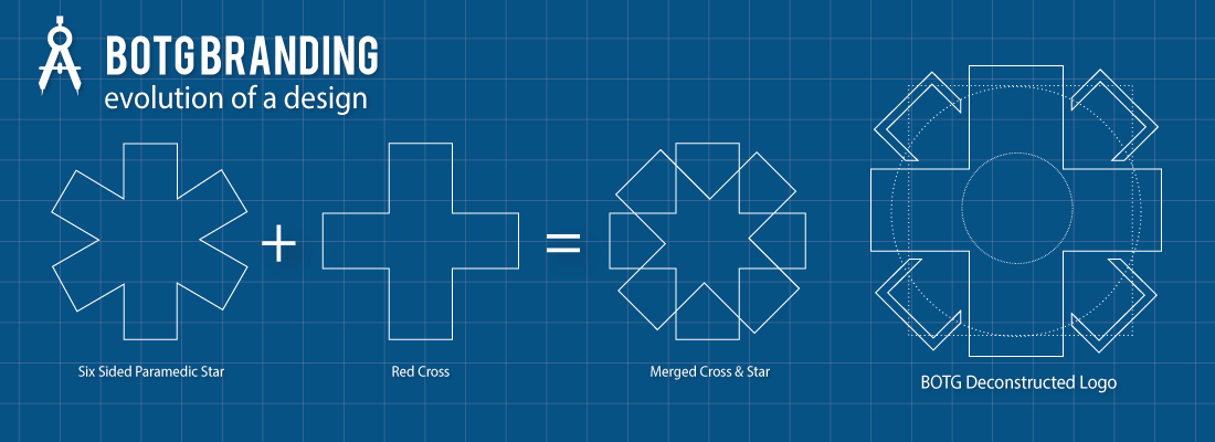
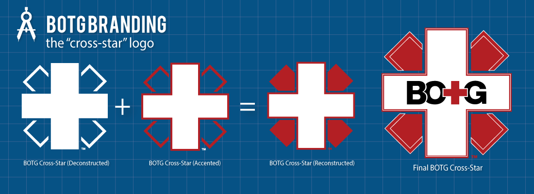
The BOTG Cross-Star logo is just that—it’s a cross between the Red Cross and the Star of Life. It represents where we come from, how we’ve evolved, and where we’re at now from a missional and operational perspective. In following tradition, we also sought to philosophically incorporate meaning well beyond what is merely assumed prima facie, when someone views the elements offered.
To get there, both of the previous symbols were deconstructed visually, and intellectually. During reconstruction, elements were shifted, broken, and modified to create specific visual context with inherent meaning attached.
Symbology
The White Cross: This is a drained or emptied red cross. This signifies a wholesale departure from the Red Cross business and response model that dominates the space we operate in, a model we believe, has become outmoded and largely ineffective.
It also represents the blood spilled by, or drained from, the bodies of the medics who paid the ultimate price in the service of others on the battlefield. While the red outline serves to remind us both where we came from and the reality that BOTG medics, because of our unconventional nature, will be seen as being on the fringe of the conventional systems or structures currently in place.
The color white represents purity, goodness, and perfection—all attributes we personally and professionally aspire too. It’s also is the traditional color of bandages, latently suggests cleanliness and freedom of infection or disease. The latter is a metaphorical goal for BOTG organizationally, in that, as we grow and develop in maturity, reach, and influence as a corporate body, we hope to prevent falling into the same processes and thinking that have caused other organizations to become ineffective and wasteful.
The Saltire (St Andrew’s Cross): The diagonal red cross superimposed with the White Cross comes from the legs or branches of the Star of Life (both elements create six distinct points), and represents not only the elements associated with the branches of care in EMS, but the “four corners of the Earth” and the major points on a compass rose (namely, North, South, East, and West). As an organization and as individual medics, we are committed to serving others anywhere in the world. The fact it resembles a “broken, sideways red cross”, is idiomatic in nature and represents our commitment to do things differently. Whereas the “X” it forms is used to warn others of danger or hazards, which we are to anyone who poses a threat to our security or that of our patients.
The BOTG Letters: Resting centered upon the White Cross are the letters BOTG, with “T” represented by a red cross.
The Cross-Star logo can be plain, grayscale, black and white, accented, or adorned in a variety of ways. But in all cases, the basic shapes remain the same and are composed of the two previous symbols noted.
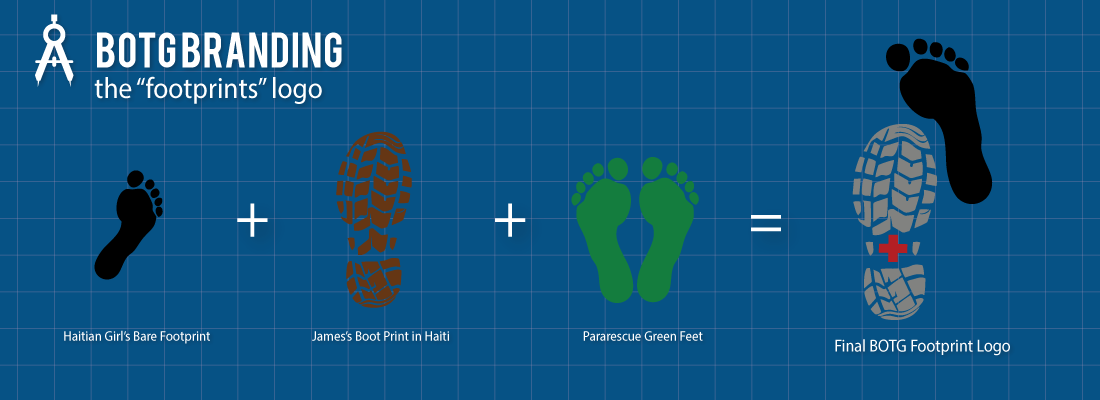
Footprints Logo
 In 2010, James L. Clark (one of our co-founders) was walking next to a young Haitian girl when he looked down and noticed she had left an almost perfect footprint in the mud next to his boot print. The symbolism immediately struck him. Both were out in the elements, in the rain and mud, at the height of a cholera outbreak in one of the poorest countries in the world—and she was barefoot. Not because she chose to be, but because she didn’t have a pair of shoes to wear. The reality of her situation was brought home by the stark contrast of the print left from his $100+ pair of custom combat boots.
It also reminded him of a “green feet” Pararescue tattoo he once saw (unfortunately, due to placement). PJs are some of the most talented operators in the world, tasked with recovery and medical treatment of personnel in humanitarian and combat environments. The origin of the logo is said to have come from Vietnam, when the HH-3E helicopters (aka Jolly Green Giant) would land in rice patties and leave huge impressions that resembled footprints. There’s apparently a long PJ tradition of getting the logo tattooed on one’s butt, to signify that they saved someone’s ass in the field.
The BOTG Footprints Logo therefore combines these elements—a bare foot print next to that of a boot print, with a red cross to symbolize our origin as military medics. The logo symbolizes the stark contrast between the poverty in many of the developing nations we deploy to, and our relative wealth and what we have to offer to those less fortunate than ourselves. It graphically represents a truism: we are most effective in communities where we can actually, quite literally, put our boots on the ground. We know that without contact, without getting involved, that there cannot be change. Our mission, as a humanitarian organization, mandates that we get off the couch, that we leave the comfort of our homes (or the wire), and show up with a goal of leaving a positive indelible imprint on the lives of others.
While we don’t (yet) have anyone with a tattoo of the BOTG Footprint logo, we do reserve the wearing of it on apparel or pins to those who’ve actually deployed. It’s our little way of showing respect (and paying homage to cool traditions) to medics like PJs who model the highest levels of training, commitment, and bravery to medics everywhere.
Ut Cetero Vivant
